
Product Photography Case Studies
The Thinking Behind the Work.
Great product imagery isn’t luck — it’s a system. Consistent lighting, a defined look, and images planned to work across your store, marketplaces and social. These projects show exactly how I build that system, and the standard I hold every shot to.
Some are client commissions, some are pieces I’ve set myself to push an idea further. Each is labelled, so you can see both the work and the thinking.
All
Client work
Research Projects
Lifestyle
Product
Personal projects where I chose the product, the concept and the styling myself — shot to my own brief. Every image here is my own work, made to show how I approach a product and the standard I hold every frame to.
Biacrè Curl
Type
Self-directed shoot
Range
Premium Hair Care
Service
Product Photography
The Idea
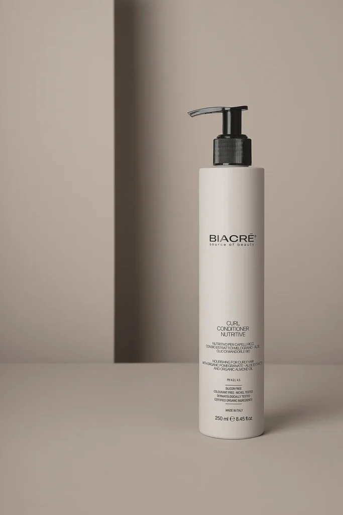
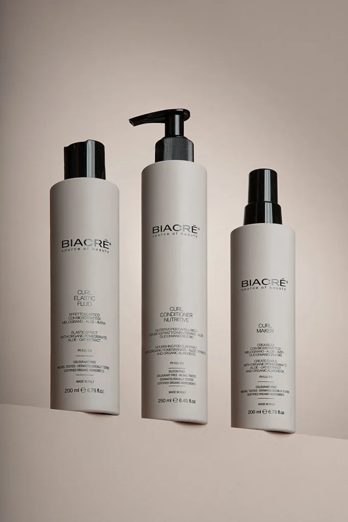
This is a high-end curly-hair range already sold through major UK retailers — but with no professional imagery of its own online. The in-store photography made a genuinely luxury product look ordinary. I set out to show how the right images would let it hold its own against premium beauty brands.
My Approach
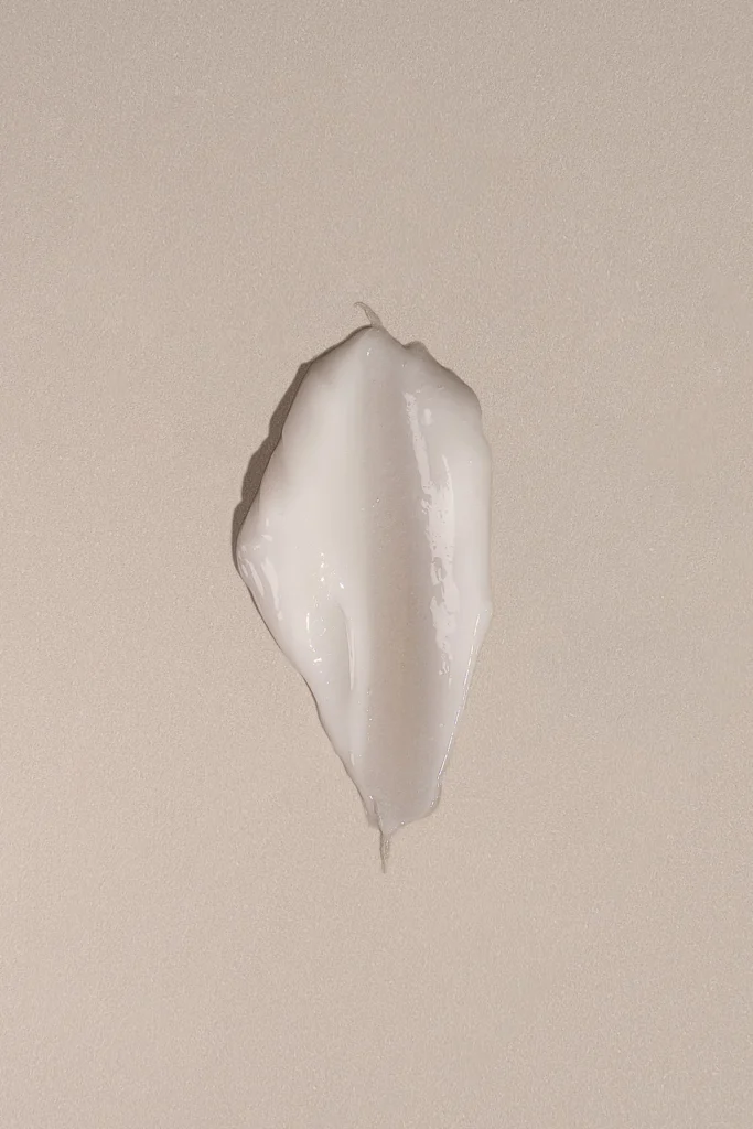
Where the existing shots were flat and functional, I went for crisp, clean and deliberate — controlled lighting, precise reflections and a considered set that reads “expensive” at a glance. Every detail of the packaging is sharp and intentional.
The styling is restrained on purpose: nothing competes with the product. Clean surfaces, careful negative space and true-to-life colour let the quality of the range speak for itself the way a luxury beauty page should.
What the Shoot Includes
✓ Crisp, high-clarity hero shots
✓ A look that matches the price point
✓ Controlled lighting & reflections
✓ Premium, minimal styling
✓ True-to-life colour & detail
✓ Composed for e-commerce & retailer listings
What This Demonstrates
It shows the gap professional imagery closes: the same product, elevated from “retail shelf” to “luxury brand” purely through photography. For any premium product let down by basic listing images, this is the difference that justifies the price online.
→ How I'd Apply This for a Client
For a brand moving from retail shelves to selling online, I’d build a clean, repeatable hero-shot standard across the whole range, then add lifestyle and in-use imagery to support marketing and retailer listings alike.
Product Photography
Product & Lifestyle
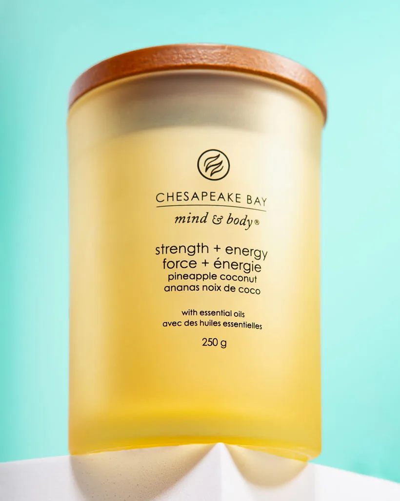
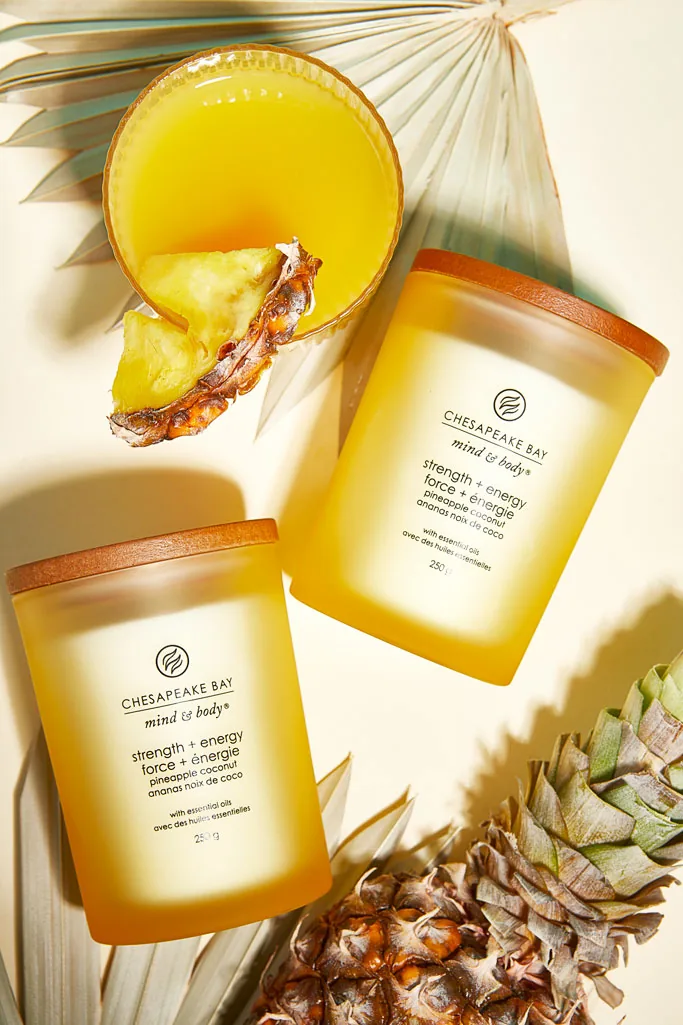
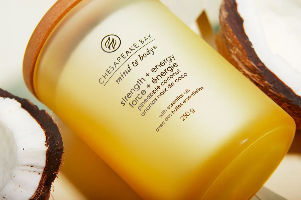
Chesapeake Bay — Pineapple Coconut
Type
Self-directed shoot
Range
Mind & Body · Scented Candle
Service
Product & Lifestyle Photography
The Idea
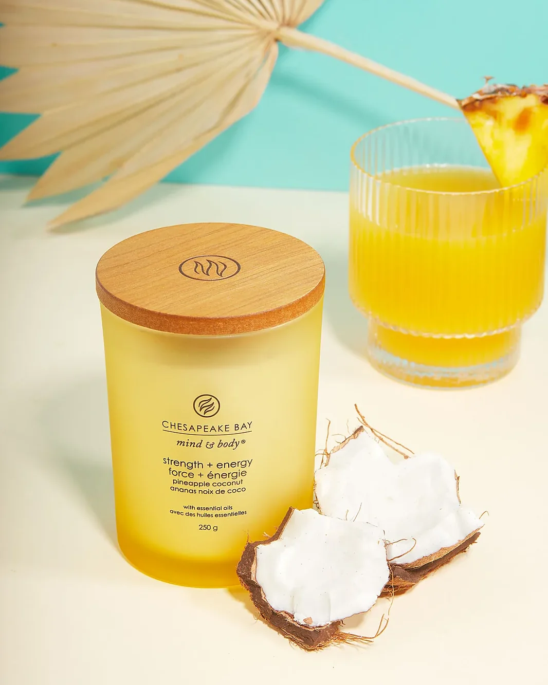
A pineapple-coconut candle sells a feeling, not a wax cylinder — sunshine, holidays, a cold drink in your hand. From Chesapeake Bay’s “mind & body” wellness line, its promise is “strength + energy”, so I wanted every image to land that the moment you see it: bright, fresh and unmistakably summer.
My Approach
I leaned into warm, high-key light and a sun-washed palette of golden yellow, coconut white and cool mint, so the frame itself feels like a hot afternoon. Hard light and crisp shadows give it that poolside, midday energy rather than a soft indoor calm.
The scent is told through its ingredients — fresh pineapple, cracked coconut, dried palm and a garnished cocktail — styled around the candle so the flavour reads instantly. It’s the drink on a page: you can almost taste it before reading the label. I also kept the frosted ombré jar and bilingual packaging sharp and legible for retail and international listings.
What the Shoot Includes
✓ Bright, summer-led lighting direction
✓ Ingredient styling — pineapple & coconut
✓ Clean hero shot for the product page
✓ Playful lifestyle scenes with a garnished glass
✓ Colour palette matched to the scent
✓ Crops for feed, stories & ads
What This Demonstrates
It shows how lighting, colour and styling can turn a single candle into a mood — making a seasonal product feel irresistible in the scroll. The same recipe works for any brand whose product is really selling an experience.
→ How I'd Apply This for a Client
For a candle or home brand I’d build a distinct lighting-and-ingredient look per scent, so a whole collection feels varied yet unmistakably one family. That gives marketing a ready bank of seasonal assets to launch each fragrance with.
Clarity Home Fragrance
Type
Self-directed shoot
Range
Candle · Diffuser · Oil
Service
Product & Lifestyle Photography
The Idea
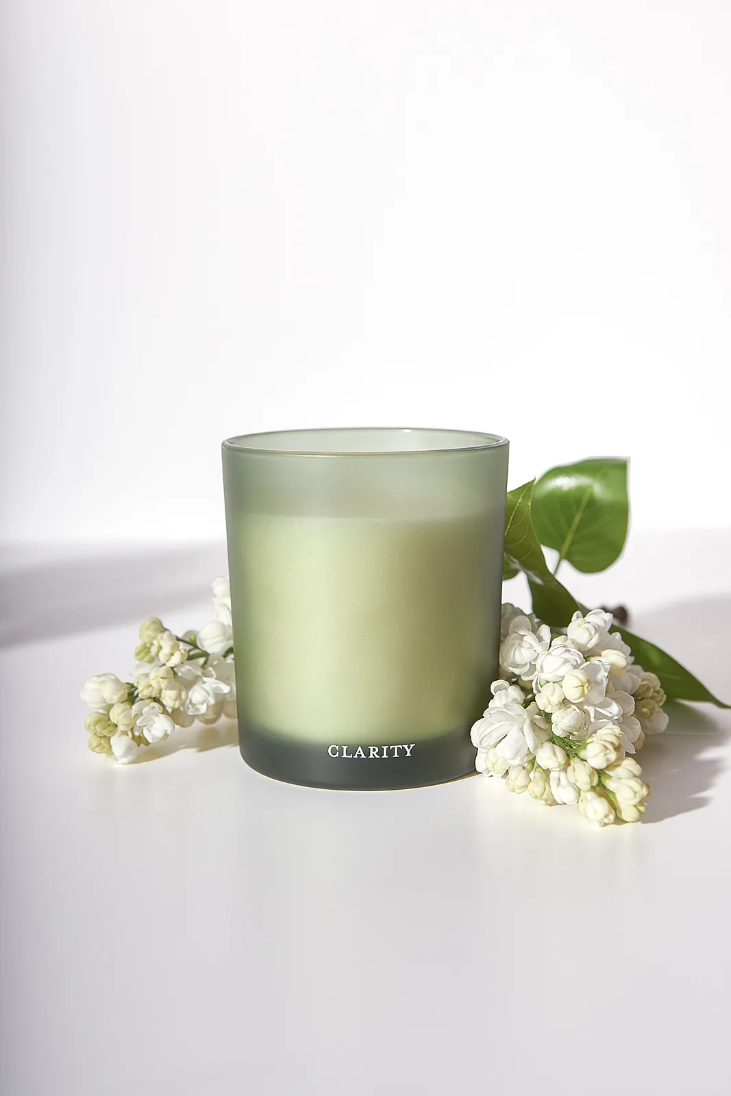
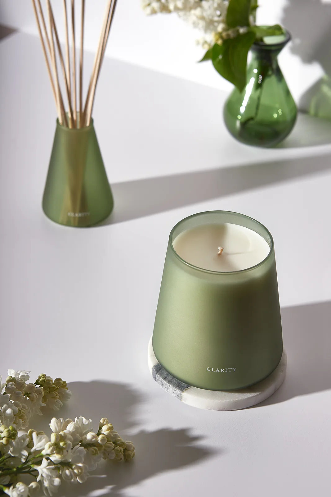
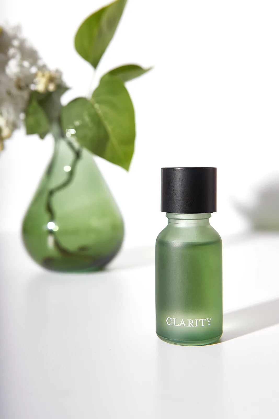
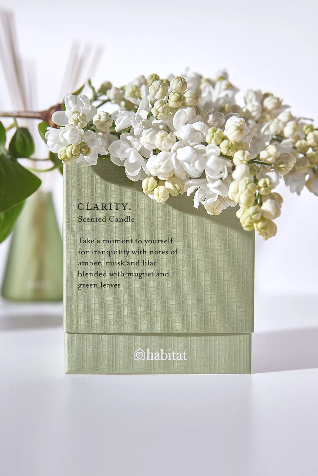
Fragrance is the hardest thing to sell online — the one thing a customer can’t experience through a screen. I photographed Clarity’s full range — candle, reed diffuser and essential oil — in a way that makes you feel the scent before you’ve read a word: fresh, green, quietly luxurious.
My Approach
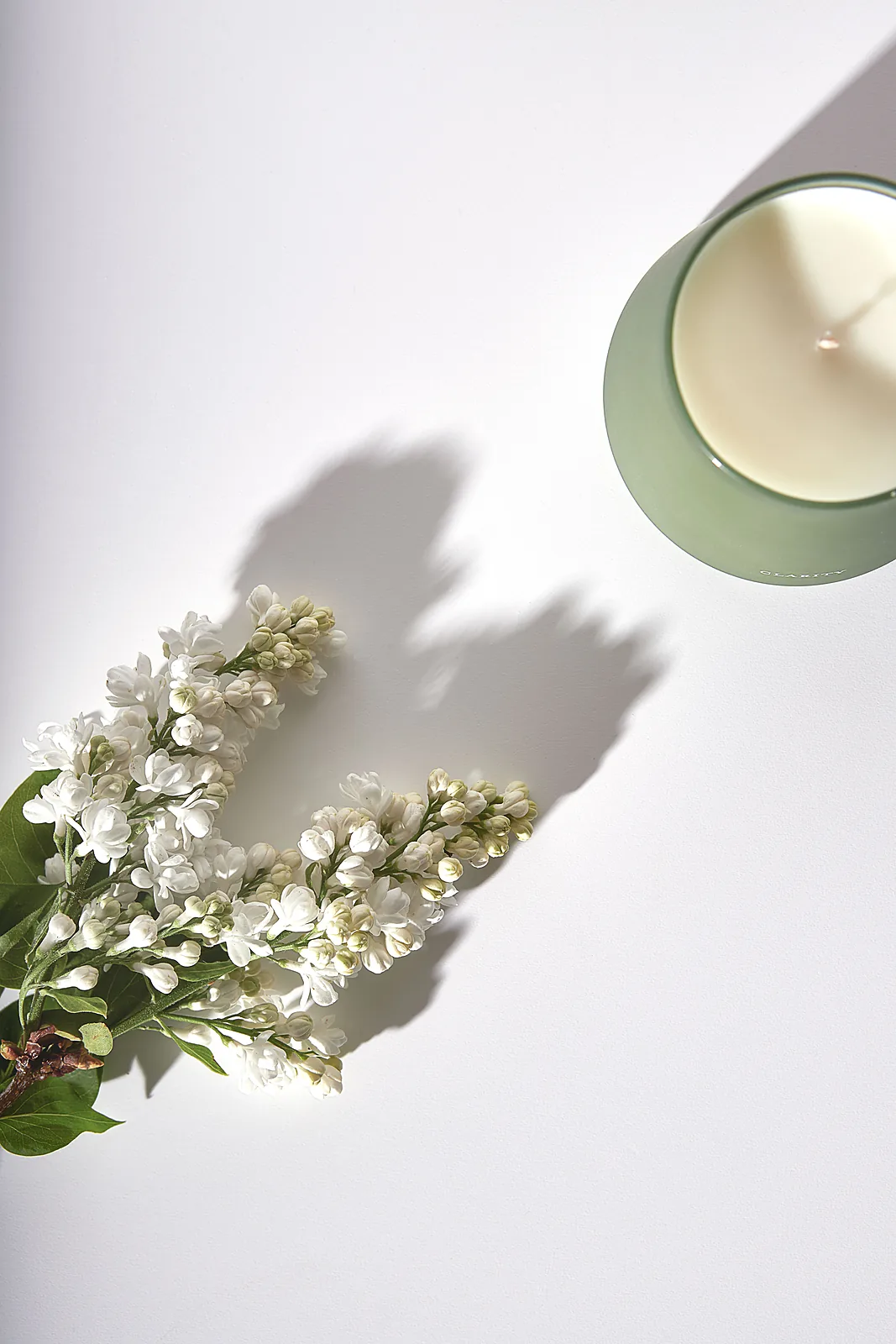
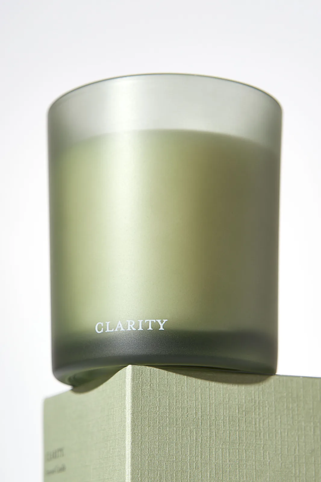
I built the shoot around Clarity’s own sage-green, frosted-glass palette — soft green glass, pale stone and long natural shadows — so the candle, diffuser and oil all read as one considered collection rather than three separate products.
The key was styling with the fragrance’s own notes: fresh white lilac and greenery placed alongside each piece to signal the scent visually. The eye reads “fresh and floral” instantly, doing the job the nose can’t do online.
What the Shoot Includes
✓ Clean hero shots for candle, diffuser & oil
✓ Ingredient-led styling to convey scent
✓ Coordinated lifestyle scenes
✓ One consistent palette across the range
✓ Gift-box and detail shots for the collection
✓ Crops suitable for web & social
What This Demonstrates
This project demonstrates how photography can communicate something as intangible as scent. Through colour, light and ingredient-led styling, the imagery helps a fragrance feel fresh and premium before a customer has even smelled it. It’s the same strategic approach I’d bring to any home fragrance or beauty brand selling sensory products online.
→ How I'd Apply This for a Client
For a real fragrance brand I’d define this ingredient-and-palette system up front, so every future scent gets its own visual cue while the collection still hangs together. Lifestyle scenes would then extend naturally into seasonal and campaign imagery.
Product & Lifestyle
Product & Lifestyle
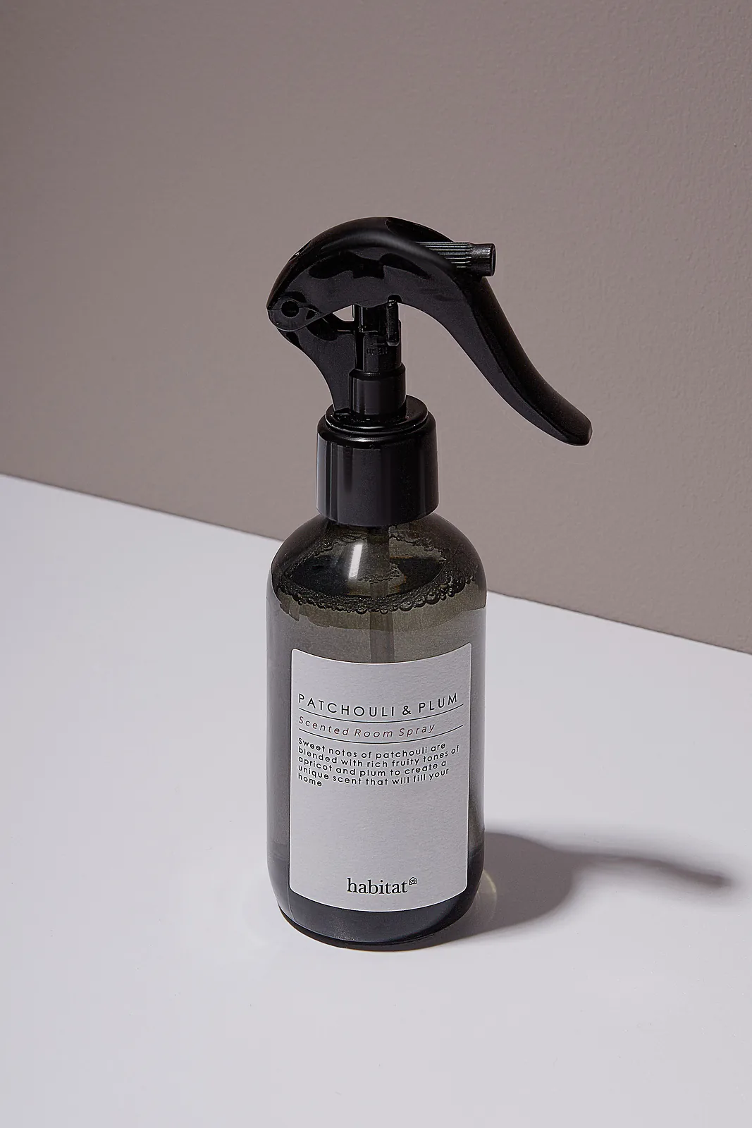
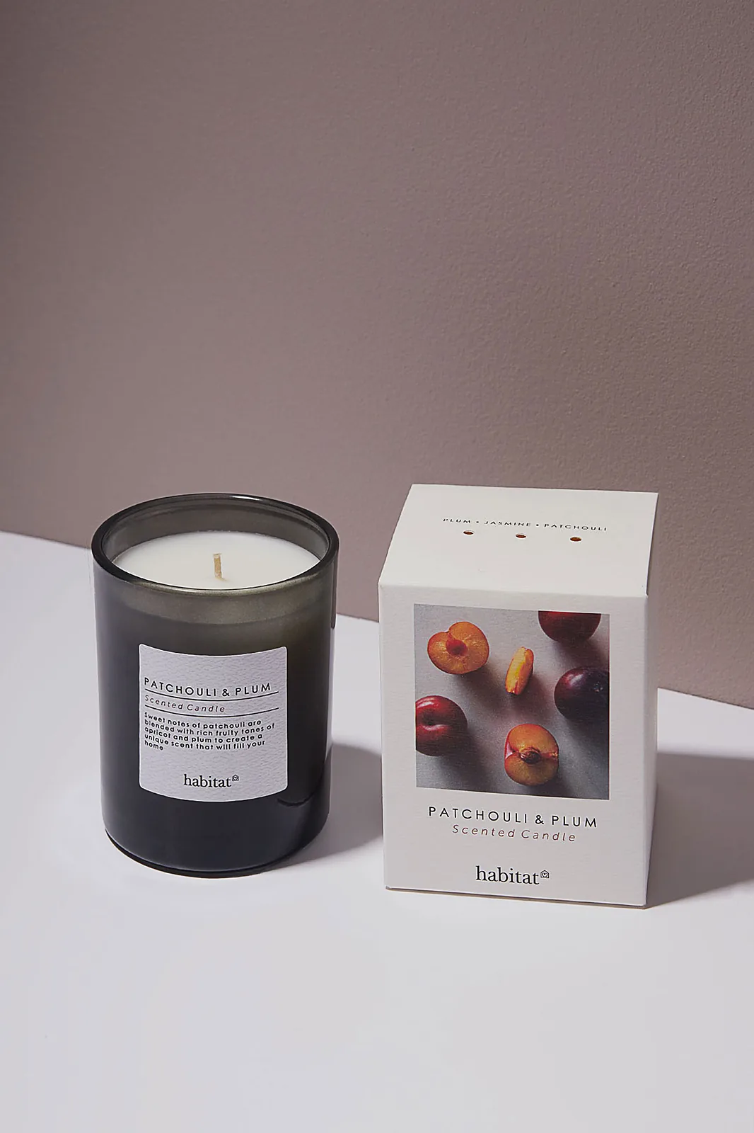
Habitat — Patchouli & Plum
Type
Self-directed shoot
Range
Scented Candle · Room Spray · Ceramics
Service
Product & Lifestyle Photography
The Idea
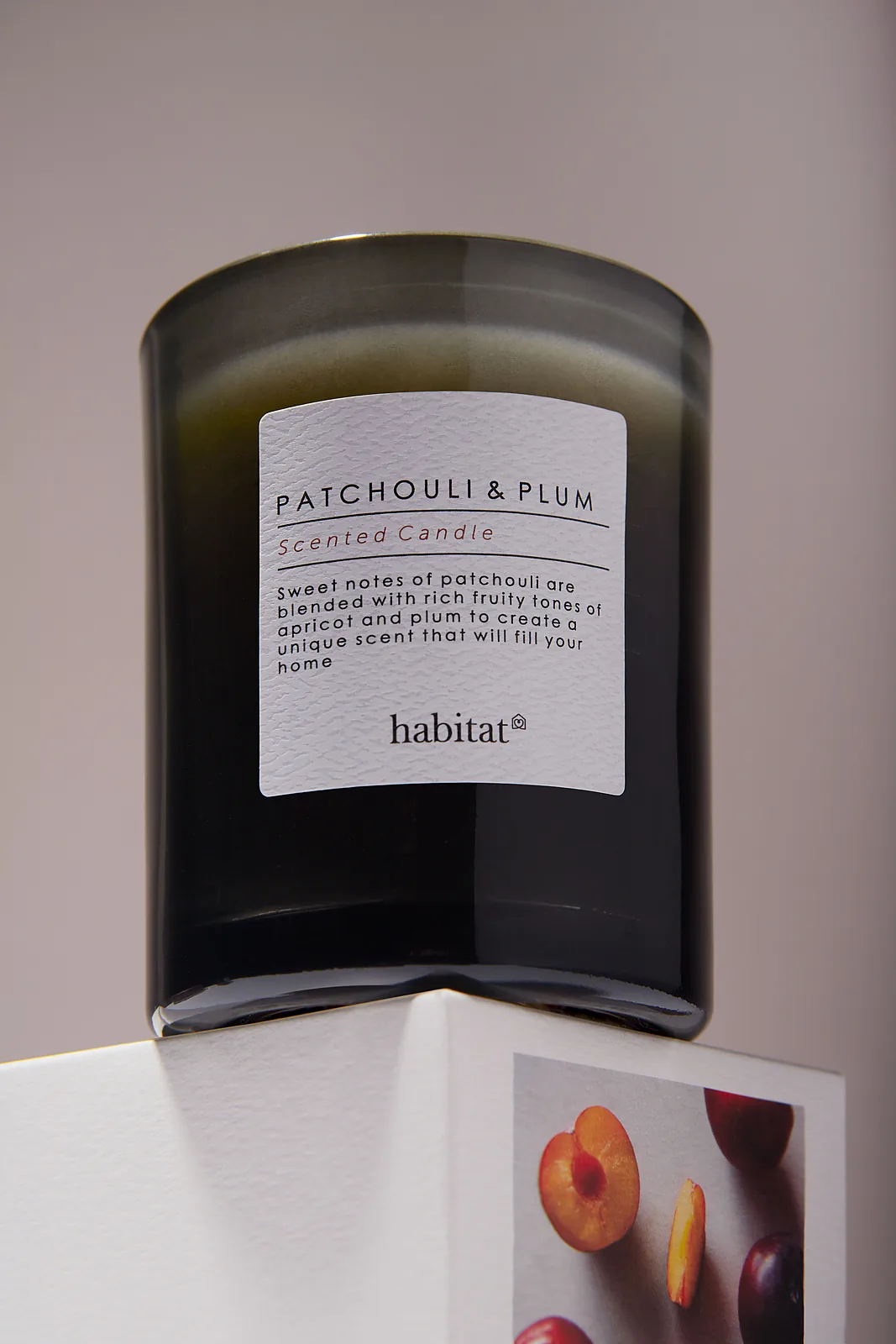
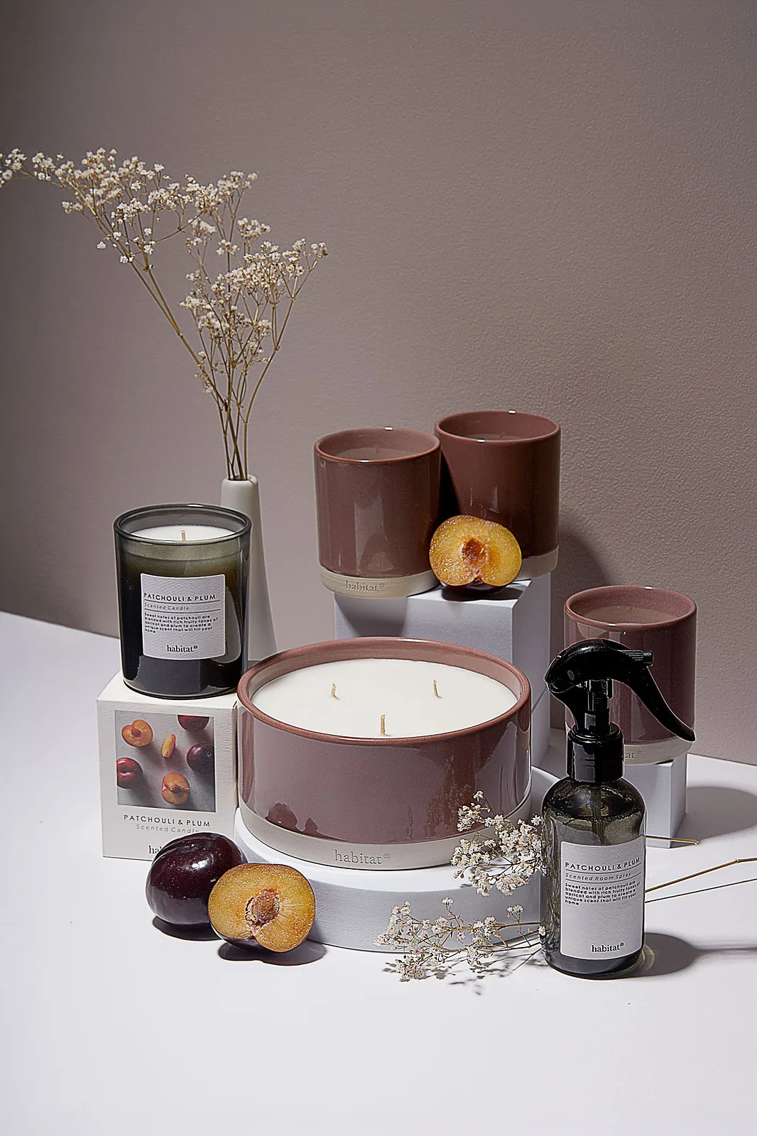
Patchouli and plum is an autumn scent — warm, fruity, slightly heavy. Rather than style around it, I built the entire set from the product’s own colours: the dusty terracotta of the glaze, the mauve of the packaging, the orange flesh of a cut plum. Every background, plinth and prop sits inside that same narrow palette, so the range reads as one considered collection across six pieces and three materials.
My Approach
The bulk of the shoot is soft and neutral — warm taupe grounds, staged heights so the eye travels through a group rather than scanning a line, and the labels kept sharp and legible on dark glass throughout. Smoked glass and glossy black plastic against a pale background is the technical work here; both hold their shape and specular detail rather than flattening into silhouettes.
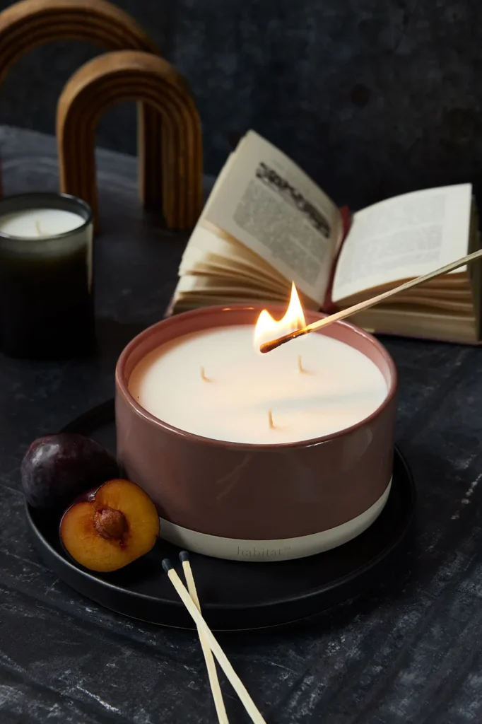
Against that, one frame goes the other way entirely: near-darkness, a match caught at the wick, the room settled for the evening. It’s the same collection, lit for the moment the product is actually used — and it gives the range a hero image with atmosphere without breaking the palette that holds everything else together.
That’s accurate to what you shot, and the contrast between the neutral set and the one dark frame is a stronger argument than either on its own.
What the Shoot Includes
✓ Low-key hero shot with live flame
✓ Coordinated range shots across six products
✓ Three surfaces in one set — glazed ceramic, smoked glass, matte card
✓ Ingredient-led styling with fresh plums and dried florals
✓ Labels kept sharp and readable on dark glass
✓ Portrait and landscape crops for web, feed and stories
What This Demonstrates
Most brands need more than one mood. A summer scent and an autumn scent can’t be lit the same way — but they still have to look like they came from the same brand. This project sits deliberately at the opposite end of the range from the bright, high-key work elsewhere on this page, and shows both that I can build a dark, atmospheric scene and that a multi-product range can be shot to hang together across every frame.
→ How I'd Apply This for a Client
For a home fragrance or lifestyle brand, I’d define one lighting system for the whole range and then a distinct mood per scent inside it — so each new fragrance launches with its own character while the collection stays recognisably one family. Over a year that builds a seasonal image library rather than a series of unconnected shoots.
Paid commissions for real businesses — the full story, exactly as it happened.
Medical Research company
Client
Anonymous
Industry
Research & Medical Services
Relationship
Ongoing since 2022
Service
Headshots · Team · Lifestyle · Events
The Relationship
The company has been a repeat client for four years. What began as consistent corporate headshots — images that had to work across LinkedIn, the website and internal communications with minimal disruption to the working day — has grown into an ongoing relationship covering the team, their brand imagery and their events.
My Approach
For the headshots, I bring a mobile studio to the client’s office so nobody has to travel or lose meaningful time away from their desk. Every image follows the same lighting, composition and editing workflow — so a portrait taken today matches one from four years ago, and new joiners drop straight in.
Beyond regular sessions, I’ve run two larger dedicated projects: a full company shoot when the team turned over completely (individual headshots plus group and team images) and a matching set for a new intern intake.
For their website, I created lifestyle content that showcases the business — recreating real “doctor and patient” consultation scenes (with their actual doctors) that present their modern medical technology in a warm, human, credible way rather than a clinical stock-photo one.
I’ve also photographed three of their events, two of them international medical conferences held at the Royal Society in London — capturing talks, delegates and the atmosphere for use across press, marketing and social.
What I've Delivered
✓ Four years of regular headshot sessions
✓ A full-team refresh when staff changed over
✓ Website lifestyle content — real doctor-and-patient scenes
✓ A matching set for a new intern intake
✓ Imagery showcasing their medical technology
✓ Three events, incl. two conferences at the Royal Society, London
The Result
Four years on, the company has one photographer covering various shoots from portraits to conferences — a consistent body of imagery spanning team, brand and events that all looks like it belongs together. Because I know the business and the setup is repeatable, they simply call when they need me, and every new session matches the last.
→ An Ongoing Relationship
The setup is documented, so new joiners can be photographed to match at any point. A standing session each quarter keeps the library current, and the same consistent approach extends naturally to team and environmental shots for the website and careers pages.
Whether it's a paid brief or a problem you're wrestling with, it starts with a conversation.
Book a free Product Image Health Check and I’ll look at where your imagery is now and what would make the biggest difference — no obligation.